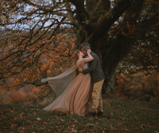
You might have a clear vision for your wedding, but do you have a colour scheme?
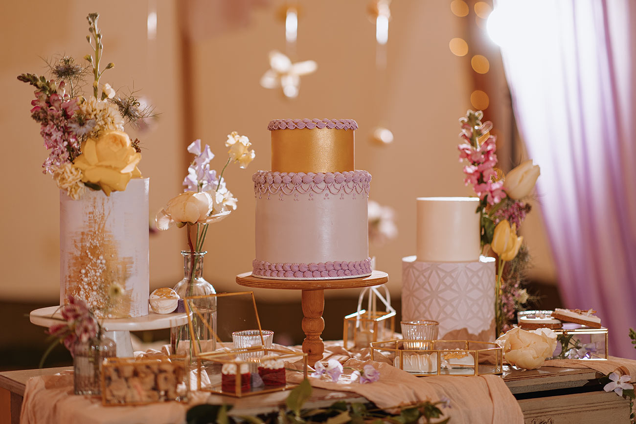
Ivyhouse Photography / Styling Kept Weddings with Laura / Cakes Cake Design by Holly Miller
With a host of details dictated by the shades you choose to splice into your wedding – from the bridesmaids’ dresses and groom’s accessories to the décor, stationery and flowers – selecting a final combination can seem like a daunting task.
If you’re struggling to pick a palette, fret not. We’ve enlisted the expert help of two wedding stylists to help you land on the perfect look for your day – in whatever colour design feels befitting and beautifully ‘you’.
.jpg)
The Unbridled / Styling Knots & Kisses / Flowers Emma Hewlett
Back to (colour) basics
First off, it’s handy to have an idea of the main types. There’s monochromatic, which uses tints and tones of the same colour; analogous – a group of three colours next to each other on the colour wheel (e.g. blue-violet, violet, red-violet); and complementary – two colours that sit opposite each other on the wheel (such as blue and orange).
Then, the most important thing – as with everything wedding – is you! “Think about what your favourite colours are and what you really don't like,” suggests Laura Dalton at Kept Weddings (keptweddings.co.uk). “You will always look back on your photos and be happy with your choice if it is a colour you like! And it will never get dated for you. Also consider your personality. Are you both a bit eccentric? Then I expect going for bolder colour choices is naturally your thing!”
.jpg)
Nova Wedding Photography / Styling Knots & Kisses / Cake Claire Arscott
Still drawing a blank? “If you’re unsure about what colours to pick or you don’t have a favourite colour then consult a colour wheel or take a look at interiors magazines to discover complementary colour combinations,” advises Nikki Sheriff from Knots & Kisses (knotsandkisses.co.uk). A consultation with a wedding planner or stylist is another brilliant way to get the ball rolling and fine-tune your ideas.
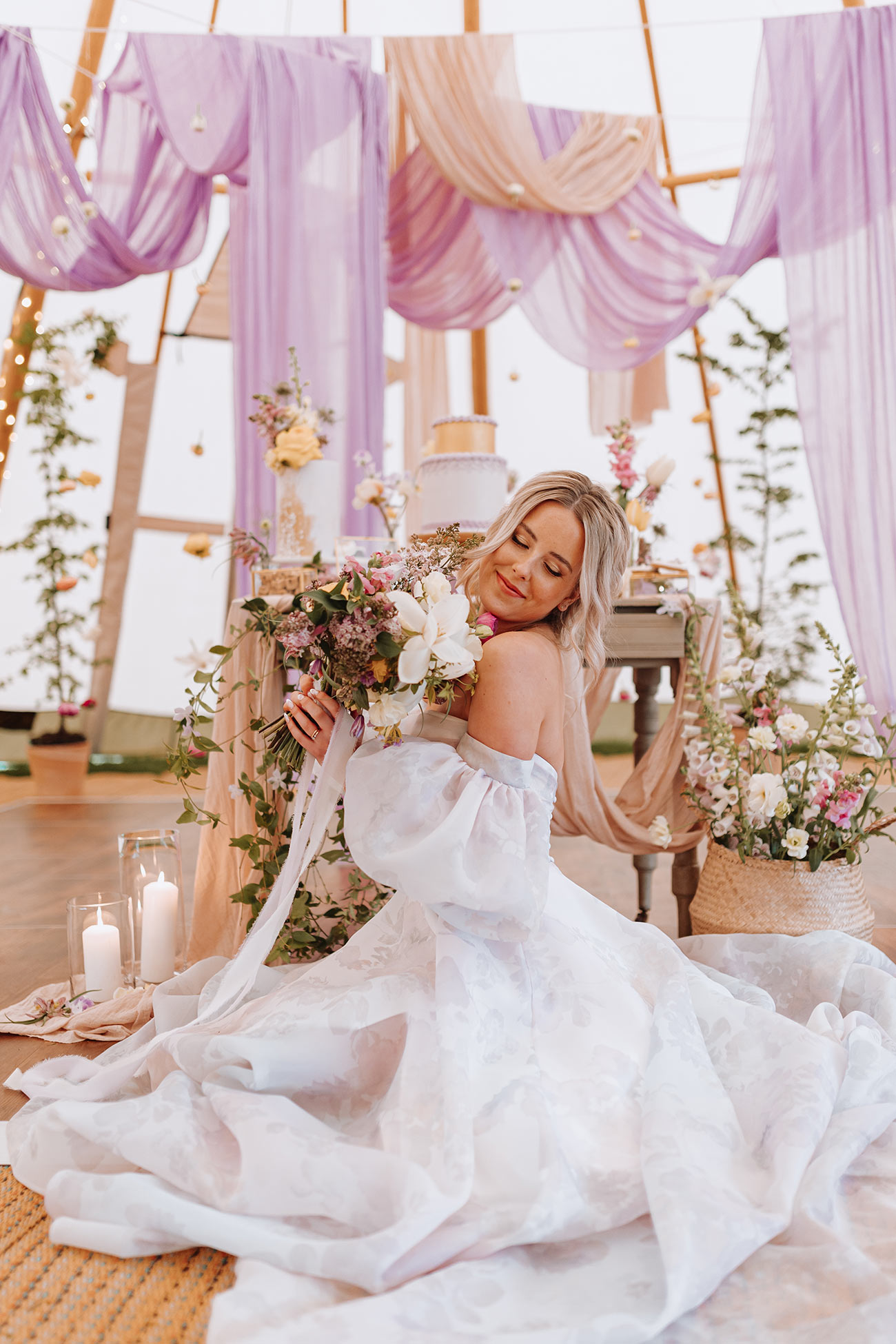
Ivyhouse Photography / Styling Kept Weddings with Laura / Flowers Indy Bloom / Dress Nicola Anne
The art of the mix
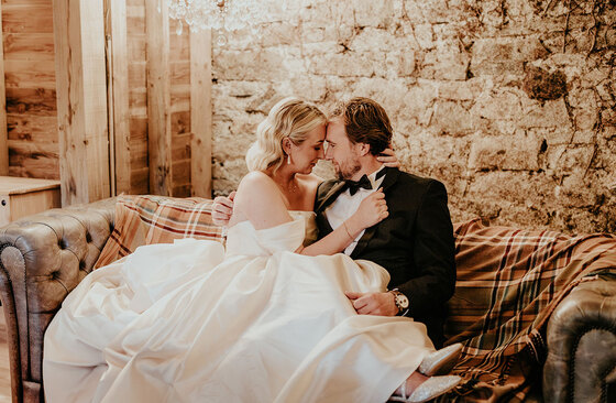
When it comes to building your scheme, Nikki recommends selecting a base palette of two or three neutrals, then adding two or three accent colours. “Neutrals don’t have to mean beige or white,” she clarifies. “If you prefer a darker colour scheme then navy and dark green can be classed as neutrals.”
Though you might be tempted to simplify your colour scheme, Nikki sounds a word of warning. “Never, ever pick just one colour and try and get your entire wedding to match that one colour – it will never work!” she says. “Your scheme will look flat, and you will be pulling your hair out trying to find the perfect bridesmaids’ dresses or card!”
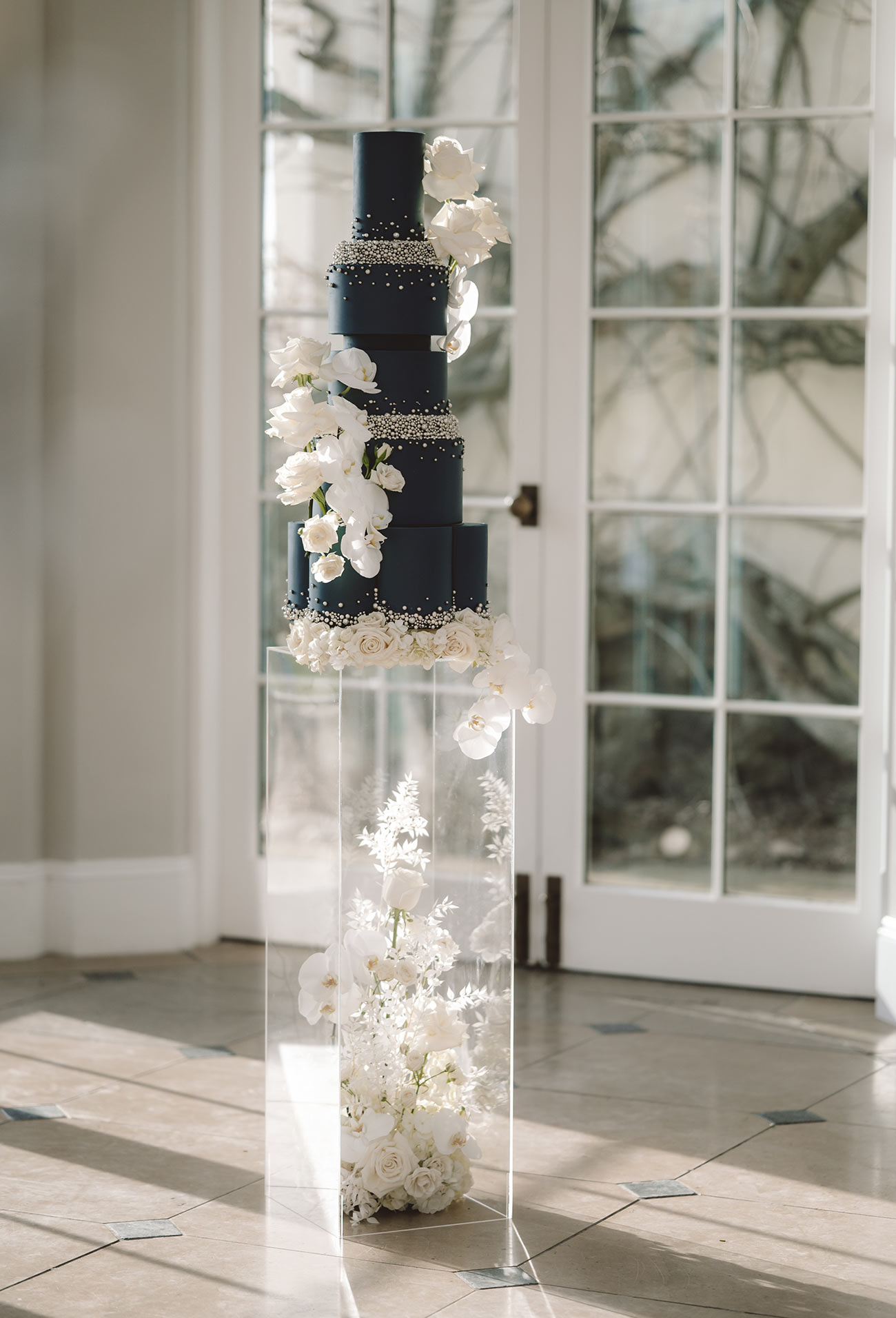
Danielle Veitch / Styling Kept Weddings with Laura / Cakes Cake Design by Holly Miller
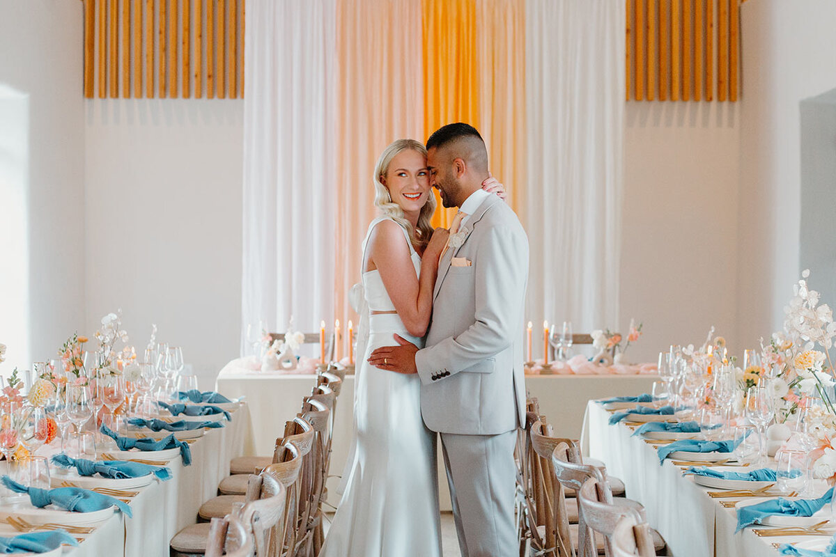
By adopting an exploratory approach and trying a few different schemes, you’ll get a better idea of what looks and feels right for you – so don’t be too strict or prescriptive in the early stages. “Think outside the box and don’t rule out unexpected colour combinations,” implores Nikki. “For a Mediterranean Sunset look I created, I wanted to use an on-trend lilac/lavender colour but decided to pair it with a beautiful burnt orange for a real accent pop! Lavender and orange are almost opposite each other on the colour wheel, but don’t be afraid to break the rules – they are just there as a guide!”
Honing in on your final choice? “Always think about whether you want a cool or warm feel to your colour scheme,” explains Nikki. “This will help you pick what tones of each colour to choose, which should be the same even if your colours are very different.” Warm schemes have a yellow undertone (such as red-orange, orange and yellow-orange), while cool palettes have blue bases (like blue-green, blue and blue-violet).
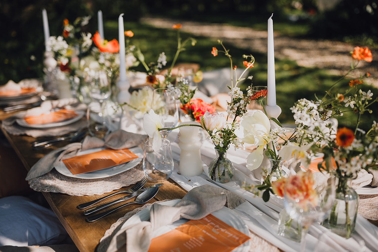
Butterfly Photography / Styling Kept Weddings with Laura / Flowers Holly Bee Flowers
Season, setting, style
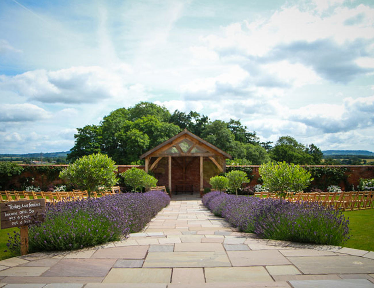
From there, it’s important to consider where and when you’re getting married. “Either pick your venue with a colour scheme in mind or pick your colour scheme after you have a venue which will complement its décor,” says Nikki. Though it often pays to be playful and experimental – and an element of contrast can create surprise and a bespoke aesthetic – too much clashing can make your wedding feel overly busy and chaotic. The idea is to opt for balance, with just a single shock or complementary accents of colour to create a sense of flow (and good taste!) within your wedding space.
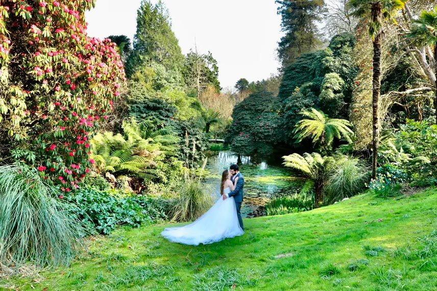
The season will also largely determine the look and mood of your day. “You don't have to go for colours based on the season, but it naturally makes more sense as the colours you associate with seasons reflect in our flowers, but also in the fashion industry,” observes Laura. “If you are looking to get married in spring, you are going to see a lot more tulips, daffodils, peonies and hydrangeas. You will also find lighter coloured suits and bridesmaid dresses making an appearance.”
In order to source items in your desired colour scheme, it’s worth considering the time frames and availability. Will you be able to buy sunflowers for your spring wedding, a sand-coloured linen suit for your summer shindig, floral brights for your Ibiza-themed Indian summer celebration, or find enough green leafy foliage for your autumn woodland-inspired wedding?
.jpg)
Nova Wedding Photography / Styling & stationery Knots & Kisses
And remember to pick something that’s timelessly ‘you’, not solely because it’s en vogue. “Seeing what colours are trending is a good place to get inspiration but try to remember that trends do come and go,” cautions Laura. That being said, if a particular trending tone happens to be one of your favourites – then go for it! “Buttery yellows are definitely a huge hit for this year!” notes Laura.
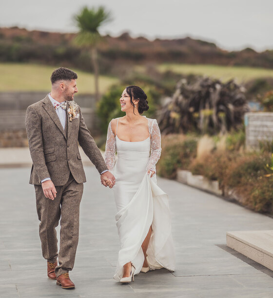
Meanwhile, Pantone’s Colour of the Year is Mocha Mousse: “a warming brown hue imbued with richness. It nurtures us with its suggestion of the delectable qualities of chocolate and coffee, answering our desire for comfort.” A versatile base shade with “sophisticated, earthy elegance” certainly seems like the perfect starting point to us...
.jpg)
The Unbridled / Styling Knots & Kisses / Flowers Emma Hewlett
Main image Mimosa Photography / Styling Knots & Kisses

.jpg)
